The purpose of the sliver element is to insure that specific content, including access to the University's enterprise Web search and crosslinks to every college and school Website, the Alumni site, Apply, and Give, are available (even if collapsed) on every page within the institution's Website ecosystem.
All University of Miami Websites must present the sliver, exactly as it appears in the specifications found on this page. This includes matching the fonts and the exact links found within each navigation tree.
Updates to the sliver will be made regularly. This page will contain the version history and changes.
If you participate in administering a Website that is NOT part of the University's central Hannon Hill Cascade Server offering, please note that you will need to update this code regularly as it changes university-wide. If you participate within the University's central brand offering in the Hannon Hill Cascade Server CMS, the sliver changes will be updated automatically.
Sliver Presentation: Desktop Views
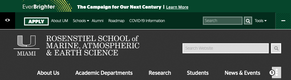
The desktop view of the sliver element spans across the full width of the browser immediately above the Website's masthead. It includes a horizontal rule (typically white) that divides the sliver region from the rest of the Website masthead area.
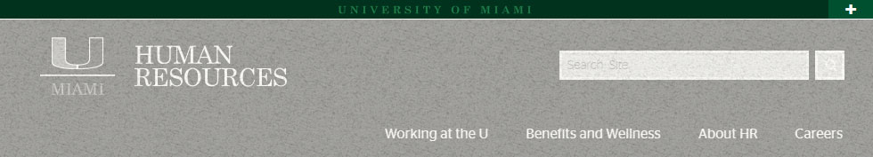
Collapsed State
The default state of the sliver may be set to either collapsed or expanded. In almost all cases, sites default to "collapsed.
Style Rules:
- The sliver height must be exactly 20 pixels (21 pixels including the horizontal rule that frames the bottom of the container).
- The background color of the container is #01321e.
- "University of Miami" must appear aligned center and must link to http://www.miami.edu
- "University of Miami" type must be Stag Book, 11 pt Strong, with appropriate letter-spacing/tracking .5em.
- The color of the "University of Miami" type is #7DCA7F
- The "plus" expander icon is part of Foundation for Icons.
- The hover state for the button should utilize the appropriate patterned background image.
- The button background color is #005030.
- The horizontal rule framing the bottom of the container is white and set to 1 pixel.
Expanded State
The sliver's expanded state appears by activating the "plus" button. It reveals navigation, search, and hover menus.
Style Rules:
- There is no transition effect to the expand or collapse action.
- The sliver height must be exactly 55 pixels (56 pixels including the horizontal rule that frames the bottom of the container).
- The background color of the container is #01321e.
- All elements within the sliver should be setup within a container that has a max-width of 1280 pixels EXCEPT for the "Expand/Collapse" button region, which should be right-aligned to the browser's right margin.
- All elements within the sliver should be vertically-aligned so as to allow roughly equal padding above and below the the element.
- The "Apply" link must be a button in All Caps with the appropriate button style and hover state.
- The "Apply" link must be Stag Sans Bold.
- All other navigation items must be Stag Sans Light, white, and present only with lead caps.
- The hover state for main nav items should not use text-decoration.
- The Search Box container should feature a semi-transparent border-box with a 3 pixel white border
- The search keyowrd entry areas should transitions from semi-transparent to white when the cursor is activated in the search box area
- The font for the search box should be Stag Sans Light
- The "Go" button uses the "search" icon that is part of Foundation for Icons.
- The search associated with this submission element should connect to an enterprise University of Miami search and should not feature a local search of the current site.
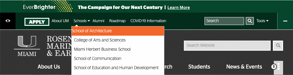
Hover Menu Style
Within the expanded sliver, there are hover menus that appear. Styles for these hover menus must follow the appropriate look-and-feel described below.
Style Rules:
- Navigation items that contain hover-nav submenu options present a white carat to the right of the navigation item's text.
- The hover menu is activated when a user hovers over any region of the navigation item.
- The hover menu features a pointer that reinforces a connection to its parent navigation item.
- Subnavigation items use Stag Sans Light.
- The hover menu container has a white background, a gray border, and casts a shadow over items below.
- Hovering on a menu item makes the menu item background color #f47321 and switches the font color to white.
- Navigation hover menus must be positioned exactly as they appear in relation to their parent navigation items.
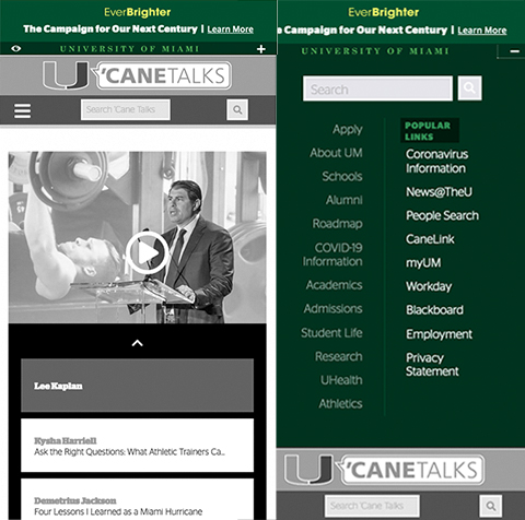
Sliver Presentation: Mobile Views
The mobile view presentation of the sliver is similar in many respects to the desktop view. This includes the appearance of "University of Miami" and the "plus" icon referenced in the desktop view specifications.
However, some unique aspects of the mobile presentation are enumerated below.
Style Rules:
- "Plus" expand control changes to a simple touchable icon (from the button treatment present on desktop view).
- No transition effects are present on expand or collapse.
- Expand and collapse actions push page content further down (rather than overlaying content).
- Expanding the sliver reveals enterprise search region with two columns of navigation, divided with a vertical rule with appropriate padding.
- Menu items should not feature link text-decoration.
- Both columns use Stag Sans Light but the left-hand column has some transparency to set the two columns apart.
Navigation Items in the Sliver
The navigation that appears in the sliver may only be edited and changed by the Division of University Communications. Areas who build slivers of their own to comply with our visual identity may not change or present alternative material in the sliver. The purpose of the sliver is to present consistent enterprise options on all Web pages.
The following links are the exact labels and links required within the sliver element navigation. The left-aligned navigation links should be:
The "Tools" navigation that appears to the right of the search box should include:
Unique Aspects to the Sliver on the University of Miami Homepage and Top-Tier Website
Individuals who browse the top-tier Website may encounter the sliver element in a slightly-altered presentation. Only the sliver on the University of Miami homepage should have the following:
- On small viewports the sliver presents the "split-u" trademark logo instead on the text "University of Miami." On all other sites, the version of the sliver described above, with the "University of Miami" typeset should be used.
- On small viewports the sliver presents a touchpad navigation element with icons. This aspect of the sliver is not required anywhere but on the University's top-tier Website.
- On desktop viewports the sliver element is expanded by default, on a majority of all other sites, the collapsed version is set by default.
Update History
9/09/22